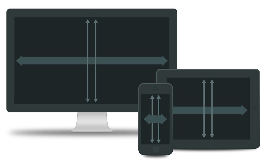
Often, we’ll be talking with folks who want a social experience, campaign, or product to be done with ‘responsive design.’ To them, this means that they will have a single set of design files, and the application will be built to scale across platforms, devices, and screen sizes. Sounds like the most streamlined solution.

This is an inflection point in the conversation when we have to ask and understand what they mean by ‘responsive design’, and historically, the answer isn’t quite accurate. We explain that Responsive Design is more about how a web experience, campaign, or product is built, not about how it is designed – which draws general agreement and nods. What we need to build, then, is typically an experience that sniffs and adjusts the front-end layout to a variety of screen sizes – what the user sees as a flexing and changing of the design. Again, nods all around.
The key point that must then be made, though, is that the actual creative design must still account for multiple screen sizes. A) “which screen dimensions” and b) “how many to design for,” both depend on your brand(s) and your target consumer(s). Do you want to target the triptych of desktop, iPhone, and iPad? You should then be designing three versions of each relevant view within the experience. Is it critical that the experience is optimized for the Google Nexus? Another set of design files. If you want to have the front-end account for a larger desktop than average (currently 1366×768 resolution), you’ll need a specific set of design files for that larger version.
Only now can we begin talking about the responsive build portion of the project. If those distinct design versions can be transitioned only by altering CSS and JavaScript, then we can absolutely create a Responsive Design for this social experience.
The next question is, does this experience warrant a Responsive Design? Web applications tend to have a more complex, or varied, userflow depending on screen size, whereas a content site will absolutely benefit from a Responsive Design.
The alternative to a responsive solution is to tailor design files to a set of individual devices and screen sizes, which will not flex and – for lack of a better term – respond to the browser width. The user will experience the front-end version for the device from which they are currently accessing the experience, campaign, or product. Only when the user decides to resize their window within the device screen, will the experience then require pinching, zooming, etc.
In the end, can we build responsive solutions? Absolutely. They key points for Responsive Design here are that it will not necessarily save time, it will not require less design, and it is not appropriate for all content or experience types. If you have questions, reach out to set up a quick one-on-one conversation with one of our Solutions Architects today.


